Examining the Importance of High Contrast Accessibility in Accommodating Low Vision Users
As an organisation, we’ve been working hard on accessibility issues. And although we still have some way to go, we’re fully committed to ensuring our products are easy for everyone to use including users with sight loss.
In fact, more recently we spoke to colour blind football commentator, Cameron Hobbs, to share his own views with us about how surveys, charts and data can be made even more accessible.
One of the points he addressed was colour contrast and how it can further inhibit colour blind users.
Following on from Cameron’s insights into colour, in this latest interview we’ve sat down with our resident web designer, Joe Baldwin, to give you his views on High Contrast Accessibility mode and accommodating low vision users.
What is Windows High Contrast Mode?
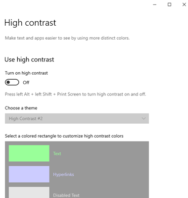
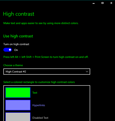
Windows High Contrast Mode (WHCH) allows the user to customise and simplify the display settings of the operating system to use high contrast or custom colours.
Some of the key benefits of Windows High Contrast Mode include:
- Providing a limited number of colour palettes which reduce the whole interface to a handful of customisable colours.
- Key lines, such as those on form input fields, are displayed in high contrast colours
- It also removes the background images and effects such as dropshadows, which can be so hard for users with low vision to perceive.
Although, Apple and Android can provide a similar level of functionality, Windows High Contrast Mode is currently the most advanced.
Built in accessibility features such as Windows High Contrast Mode are important because they allow people with access needs to use devices without purchasing additional assistive technologies such as screen magnifiers. Other settings include built in text resize, screen readers and options to customise inputs such as mouse and keyboard settings.
While working on the improvements to our accessible survey theme I looked at the WebAim low vision survey from 2018. This sample highlighted that 30.6% of users were using high contrast mode or settings. The need for high contrast settings becomes apparent when you consider a further and more recent survey from the same organisation, which identified that within a sample of one million homepages, low contrast issues was the most common accessibility error affecting 85% of pages sampled.
You can access Windows High Contrast Mode through the Windows settings menu, by selecting the Ease of Access and then the High Contrast tabs, before turning the Use High Contrast toggle to on.
Find out more about how to use Windows High Contrast Mode or change the settings of your device in the excellent My Computer My Way guide from AbilityNet.
Why is contrast so important for accessibility?
To answer this question, I think you need to consider the extent of sight loss among website users, as well the degree to which people see things differently.
For instance, The RNIB (Royal National Institute for the Blind) estimates there are more than 2 million people in the UK who have a significant degree of sight loss, while the numbers of people with mild sight loss are even higher. Tesco have identified that 40% of its iOS app customers are using non-default text sizes on their device.
Then when you also consider how many users see colour differently, that’s approximately 1 in 12 males and 1 in 200 females, it becomes even more obvious why contrast is so important to accessibility.
When it comes to eye conditions; sight loss is both a wide spectrum from mild to severe combined with variations in how vision is affected including:
- Blurring
- Light sensitivity
- Reduced field of vision (such as tunnel vision)
- Reduced depth perception
- Involuntary eye movement (such as nystagmus)
Many people who have sight loss have more than one condition.
For example, accessibility specialist Bryn Anderson who gave feedback to our team earlier in 2020 has albinism. Bryn’s vision is impacted in several ways including blurring, depth perception and nystagmus or eye movement. In this video clip Bryn and his sister Rose who also has Albinism share information about their vision.
Bryn has advised us on how we need to consider high levels of browser zoom and text resize on our products. Bryn stresses the importance of inclusive responsive design which accommodates users on any screen size and zoom level.
What’s interesting about all of this is that high contrast mode is not the only thing we as designers should be thinking about. This point can be further reinforced when you consider the experiences of our own accessibility consultant, Katherine Moonan, who has mild sight loss, which is affected by poor colour contrast.
While Katherine has always had relatively mild sight loss, as she’s got older and developed other eye conditions such as age-related sight loss, she’s now finding it hard to read small print. Subsequently, she relies on increasing the text size on her phone, as well as relying on other settings such as browser zoom, reader view and speech output to read large blocks of text. She also finds it hard to read low contrast text. And if it’s designed with a lightweight font and she’s not able to use a reader view, she will more than likely abandon that page.
In this instance Katherine would benefit from a web page, that had a more friendly design in terms of its body text and font weight.
A good example of this is the simple design change that we made to the text on our website earlier this year, which has made a big difference to its legibility.
By increasing the font-weight used for blocks of text, we’ve made our text easier to read:
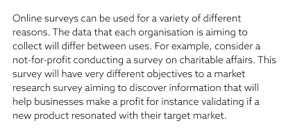
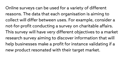
The text on our website meets WCAG 2.1 AA guidelines. However, due to the previously light-weight font, the text looked faint and appeared to be low contrast.
The great thing about this change is that it was relatively simple to do as well. All you need to do is adjust the relevant CSS rules. We simply adjusted the font-weight of the default text on the page from 300 to 400. Body {font-weight: 400;}
However, in terms of features to help low vision users, the value of high contrast mode, particularly the one offered by Windows, is a great feature for users who want to customise their default colours and text, so they are much easier to see and read.
If the operating system adapts the colours in high contrast mode, why is it still important for web product teams to be aware of the High Contrast Accessibility mode during development work?
It’s important because while features such as high contrast mode, will accurately translate around 90% of the time, there may be occasions depending on how a product designer has displayed something on a digital page, when high contrast mode will struggle to translate that item into useable colours. This is particularly the case if that individual or business didn’t consider accessibility issues.
It’s therefore crucial for designers to conduct thorough accessibility testing with browsers and operating system settings.
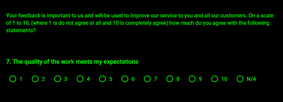
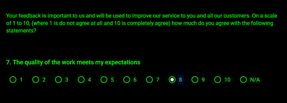
A good example of this is the work we did for our accessible survey theme. We tested it in high contrast mode to resolve a few things that weren’t initially working.
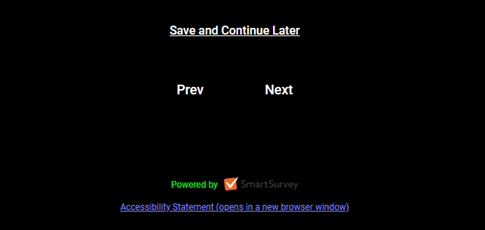
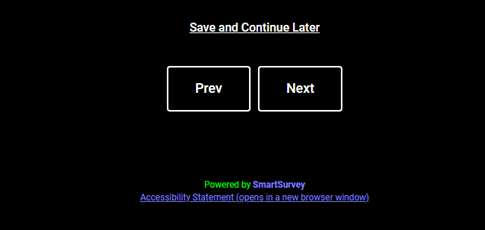
A good illustration of this point concerns the buttons that we initially used for this page. Instead of displaying as buttons, they showed up as text only. This meant that we had to update the CSS code, in order to guide high contrast mode about what it should do in this instance, via a selection of keywords that high contrast mode provides. We were then able to use these keywords to colour a number of items. You can visit the W3C website system colour definitions to find out more about system colour keywords
Here are some examples:
I think the main takeaway from all this is that whatever digital platform a business may be developing, it’s crucial for them to ensure its fully compatible with any operating systems that provide high contrast mode.
What have we been doing in the area of High Contrast Accessibility to make our website, surveys and other services easier for our clients to use?
Probably the best place to start with is our accessible survey theme, which is now fully compatible with high contrast mode.
However, there were a few challenging parts that we needed to complete before its launch. These concerned the focus indicators and buttons. When we refer to the focus indicator, we’re talking about the keyboard equivalent of the mouse pointer. It’s a visual highlight which indicates the currently selected link or control.
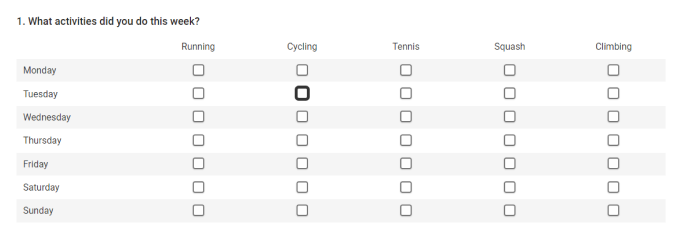
Here are some examples:
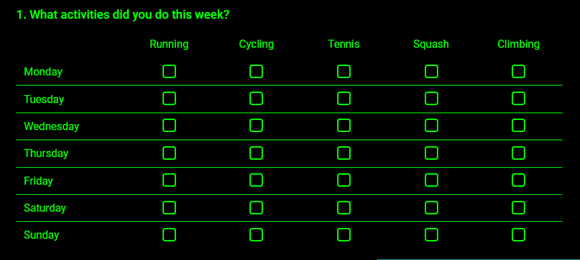
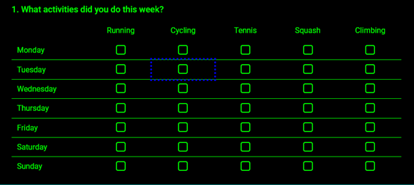
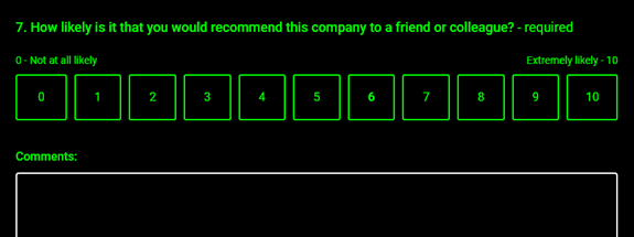
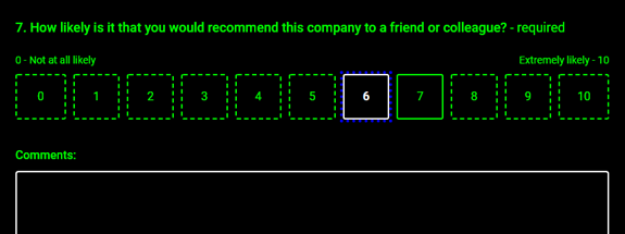
We are also currently checking the whole of our website to ensure that it is fully compatible with high contrast mode. After that we will move on to reviewing our app.
As a company, we understand that all our products need to accommodate a broad range of users including those who rely on accessibility settings. Understanding more about how users adjust their devices then testing our products with accessibility settings is an important part of our accessibility related work.
We are also working towards full compliance with the Web Content Accessibility Guidelines (WCAG) accreditation standard. By doing this we should accommodate even more users and a greater variety of settings.
We look forward to introducing further developments in due course.
Find out more about how to work with High Contrast Mode
- How to use Windows high contrast mode – AbilityNet
- Working with High Contrast Mode – Eric Bailey (video for ID24)
- WHCM and System Colors by Adrian Roselli
- Styling for Windows High Contrast with Standards for Forced Colours by the Microsoft Edge team
- How Users Changes Colours on Websites by Anika Henka (GDS)


