Say Hello to Your New-look SmartSurvey Surveys!
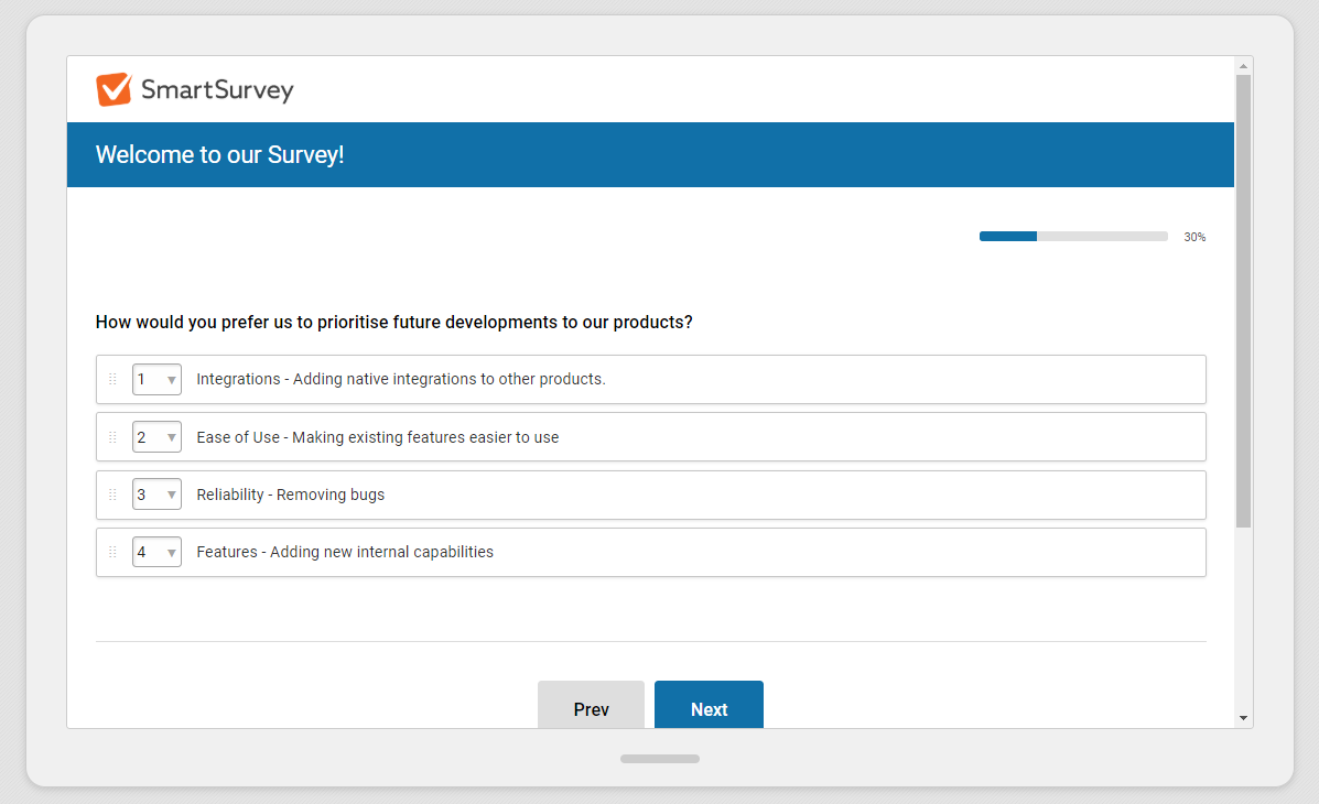
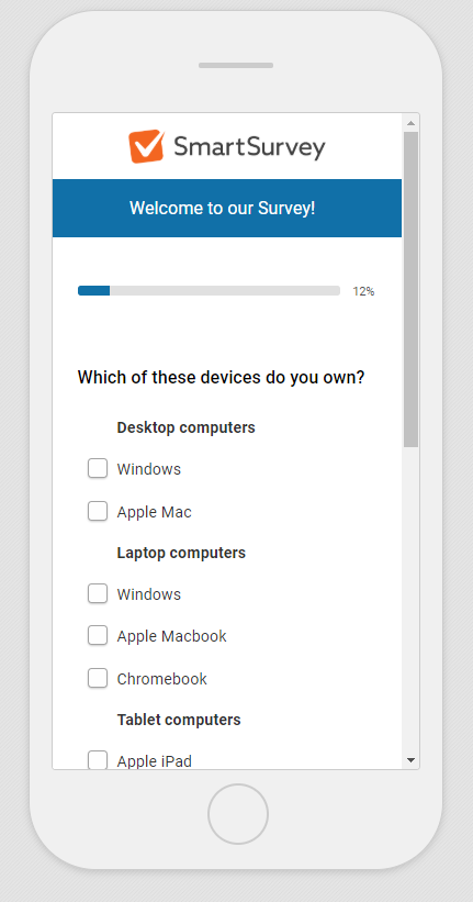
Something that’s come back to us as a point of feedback recently was that the default survey theme used on most SmartSurvey Surveys was looking a little old and dated.
So, we’ve been hard at work creating a brand new, modern theme for our users and their respondents.
If you’ve created any new surveys since last weekend, you may already have seen it.
It’s available to all our users and has the name “Default Blue”. It’s set to be the default choice for any new surveys that get created, (unless yours is an enterprise survey account with default templates set up)

We’re currently in the process of changing over all our existing templates to use this theme. We have found in testing that it’s easier to interact with and looks great on all kinds of devices.

The theme can be applied to existing surveys, not just new ones, and changing a survey theme is easy – just follow the steps in this guide.
It’s been thoroughly tested by our team to ensure compatibility with all questions types and options.
If you prefer the original look, that’s available as well. That’s been renamed “Classic Blue” and is also available to all our users.


